Client:
Ace Friction
Project:
Branding Package (Including logo, packaging, colours, and fonts)
Goal:
Build a cohesive branding package
Designing Premium Packaging and Branding for a Men’s Shoe Start-Up
This project focused on developing the core branding and packaging for a theoretical men’s shoe company in Australia. To add an extra challenge, the brand name was generated randomly, simulating the experience of working with a business that has chosen a name without strategic consideration.
The project required a complete brand identity that would inspire desire across key touchpoints, including shoes, shoe packaging, display tags, and canvas bags. To position the brand alongside industry leaders such as Nike and Adidas, a black and silver colour palette was selected to balance affordability with a premium, exclusive aesthetic, reflecting the visual language of limited-edition footwear releases.
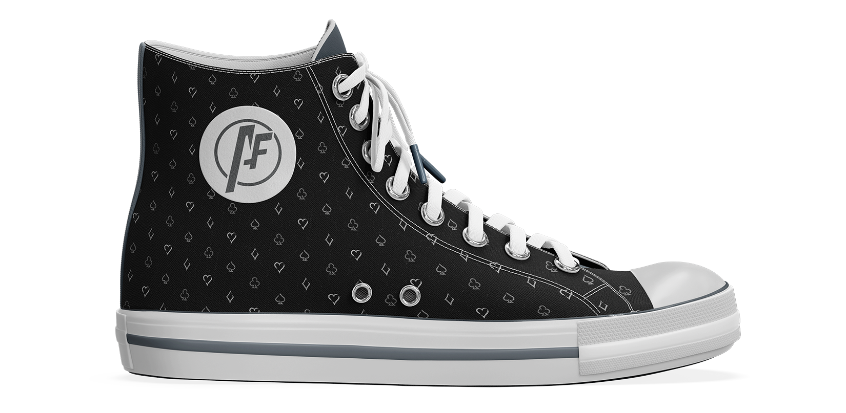
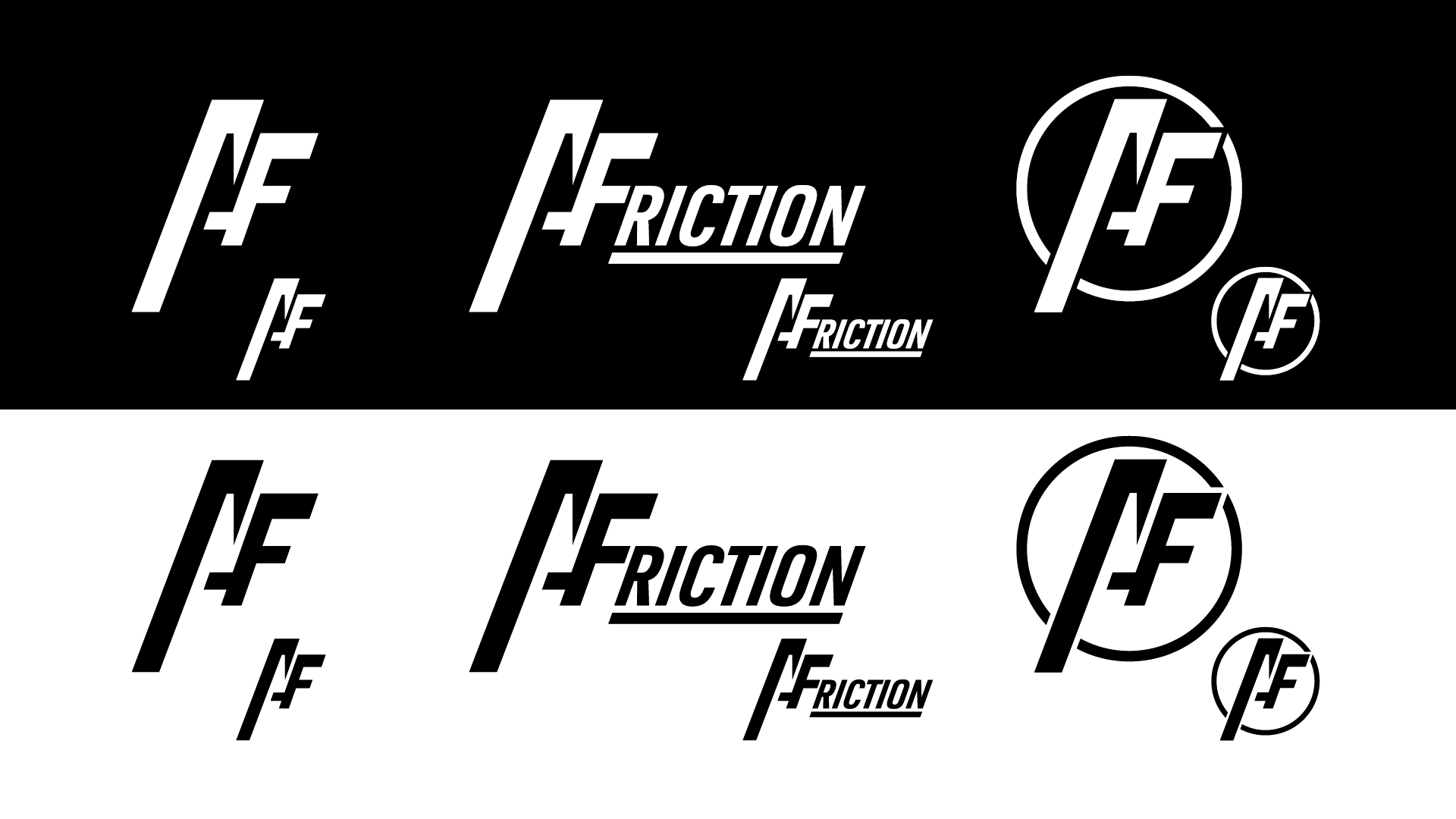
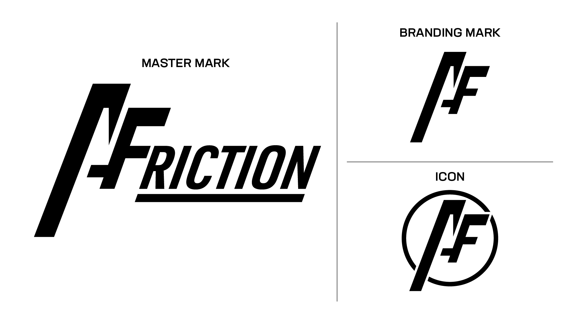
Logo Design and Variations
Ace Friction has three variations of its branding marks, the Master Mark, the Letterform/Branding Mark, and the Simple Icon. While limited in number, this range ensures consistency and recognisability across all products and promotions.
The Master Mark is the most comprehensive and recognisable, and should be used wherever possible to maximise brand visibility. The Branding Mark and Icon are derived from the Master’s iconic “AF” symbol, maintaining a clear connection to the overall brand. These marks can be scaled down to 12mm in height, making them ideal for social media icons, favicons, or other small-format applications.
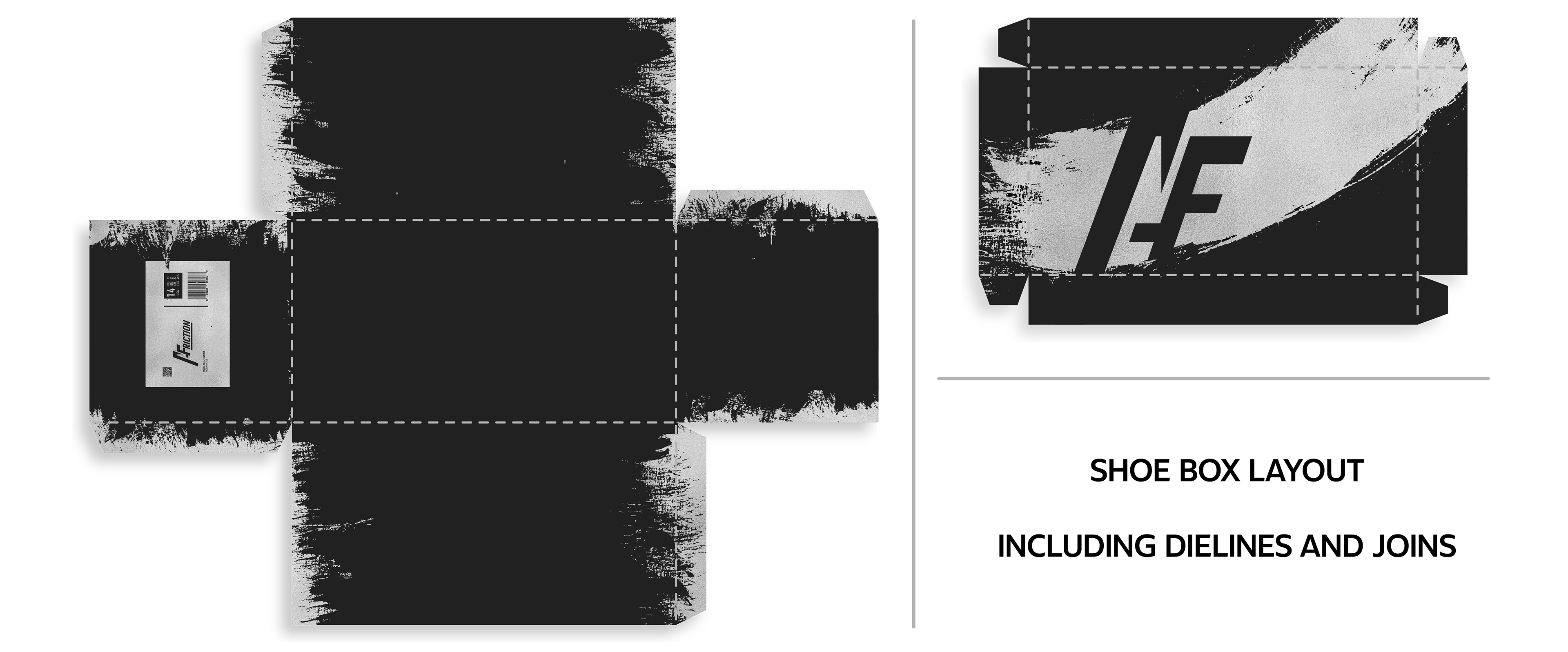
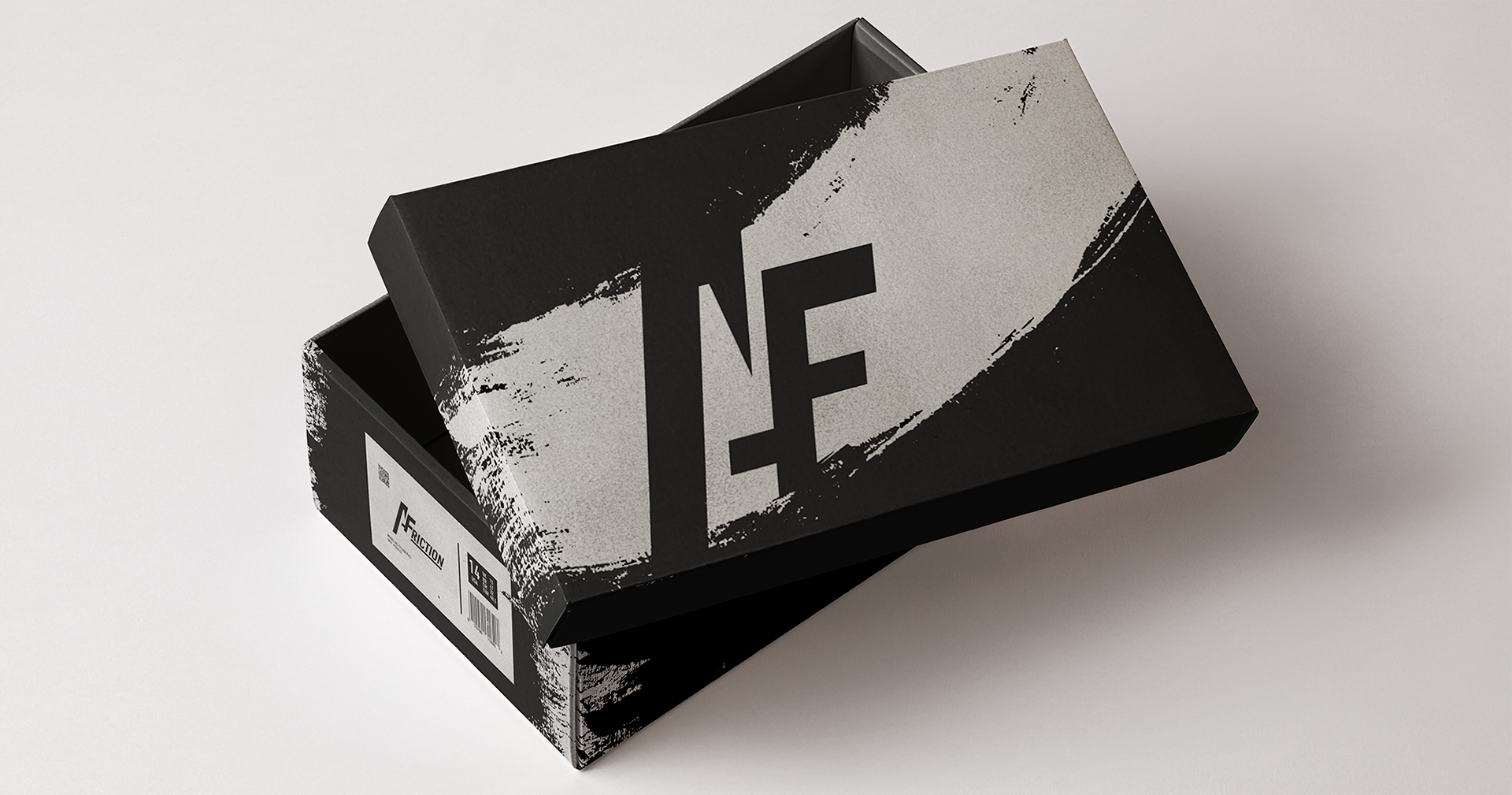
Packaging Design
The shoebox packaging design balances visual impact with clarity, resulting in packaging that is both striking and brand forward.
The packaging combines rough metallic silver textures with matte black finishes. These clashing materials instill a sense of the product’s durability and resilience in potential consumers, and by incorporating the branding mark within the brush texture, the packaging becomes instantly recognisable while on display.
Working with textures that appear messy and chaotic presents a challenge even for experienced designers. These outcomes successfully capture a sense of controlled chaos, clearly expressing the desired aesthetic.
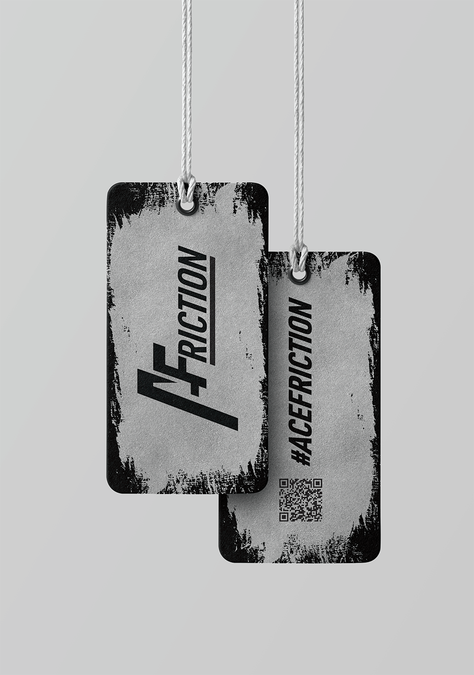
Additional Touchpoints
In addition to the product packaging, additional branded touchpoints were created. In order to ensure consistency across these touchpoints and the great brand as a whole, a complete branding campaign and style guide were also created.
These elements were designed not only to work as a cohesive unit together but also as highly recognisable individual products. This approach has allowed the brand to take on its own unique identity. With even the simple brushstroke, used across each of the touchpoints, becoming iconic and identifiable in their own right.
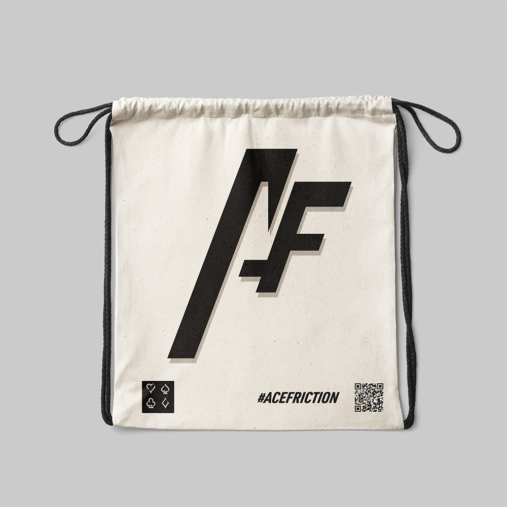
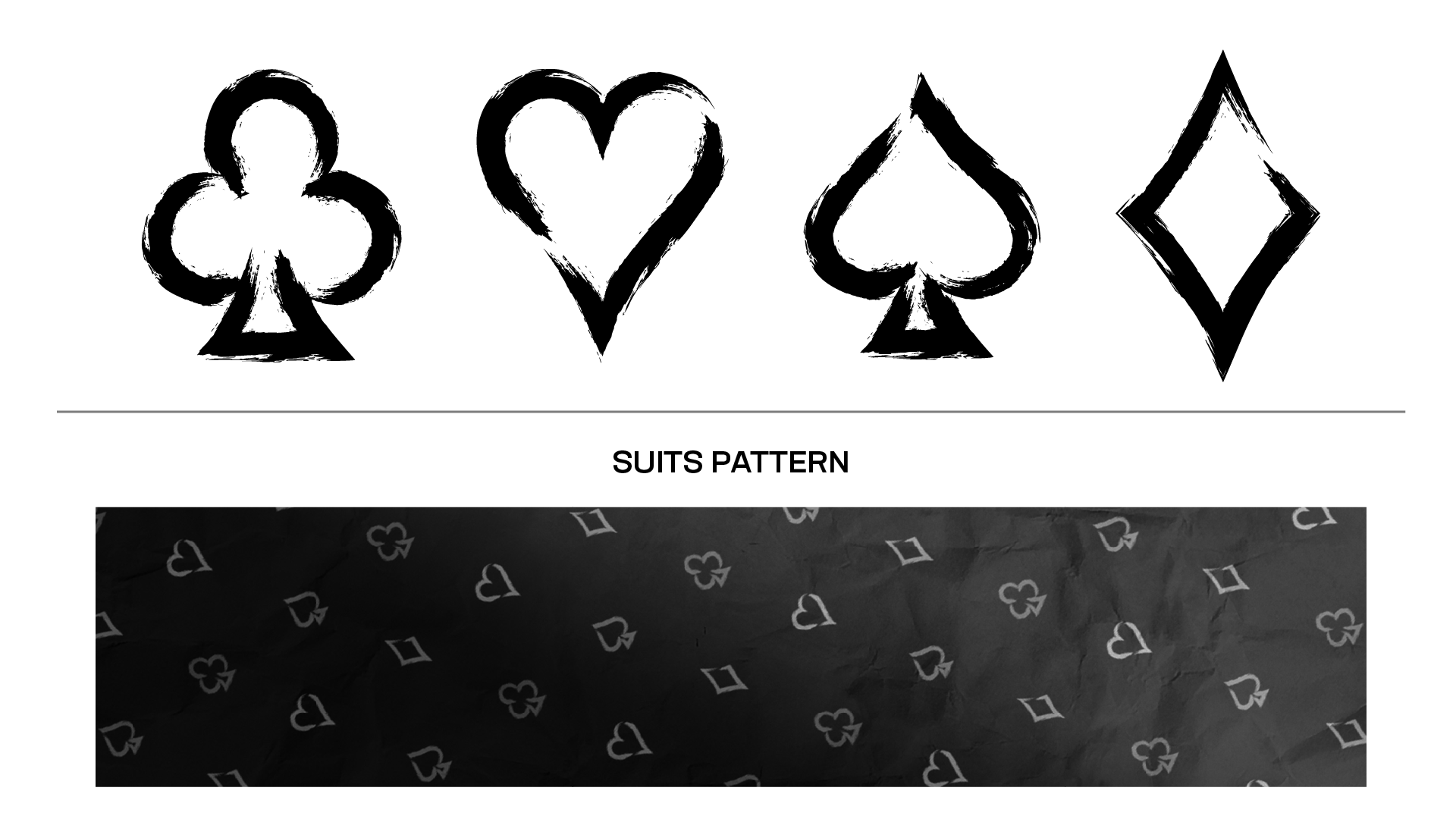
Playing Card Suits
As a reference to the “Ace” in Ace Friction, playing card suits were incorporated throughout the branding and product range, creating a strong association between the brand and the idea of winning. This visual metaphor for skill, success, and winning reinforces the brand’s competitive positioning.
Proof of Versatility and Viability
All logo variations have been tested on both black and white backgrounds to ensure clear legibility, strong contrast, and consistent visual impact across a wide range of applications, as shown below.