Client:
WildFocus - Energy Drink
Project:
Packaging and Brand Design
Goal:
To design a packaging-first brand.
Naturally Driven. Purposefully Focused.
This project focused on the development of the WildFocus brand identity and its application across key packaging elements. The name WildFocus reflects the brand’s core ingredient and its purpose. Wild references the use of lion’s mane mushroom as a natural caffeine source, while Focus speaks to the product’s functional benefit.
While positioning to enter the energy drink market, WildFocus was designed to challenge existing conventions. As nearly two-thirds of energy drink consumers are male, the brand intentionally targets the largely untapped female demographic, offering a more natural caffeine alternative within the male-dominated category.
While positioning to enter the energy drink market, WildFocus was designed to challenge existing conventions. As nearly two-thirds of energy drink consumers are male, the brand intentionally targets the largely untapped female demographic, offering a more natural caffeine alternative within the male-dominated category.
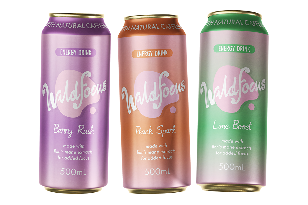
Brand and Can Designs
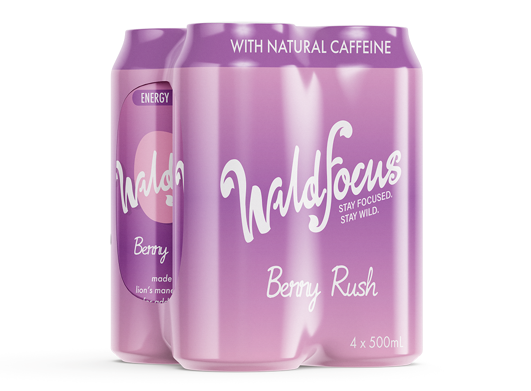
The primary design element and main consumer touchpoint for WildFocus is the can. At launch, the brand features three flavours: Berry Rush, Peach Spark, and Lime Boost.
The WildFocus core brand colour is pink, establishing a strong continuity and immediate brand recognition. Each flavour is distinguished through its own corresponding accent colour, these being purple, orange, and green, which allows for clear differentiation while maintaining a cohesive visual system across the range.
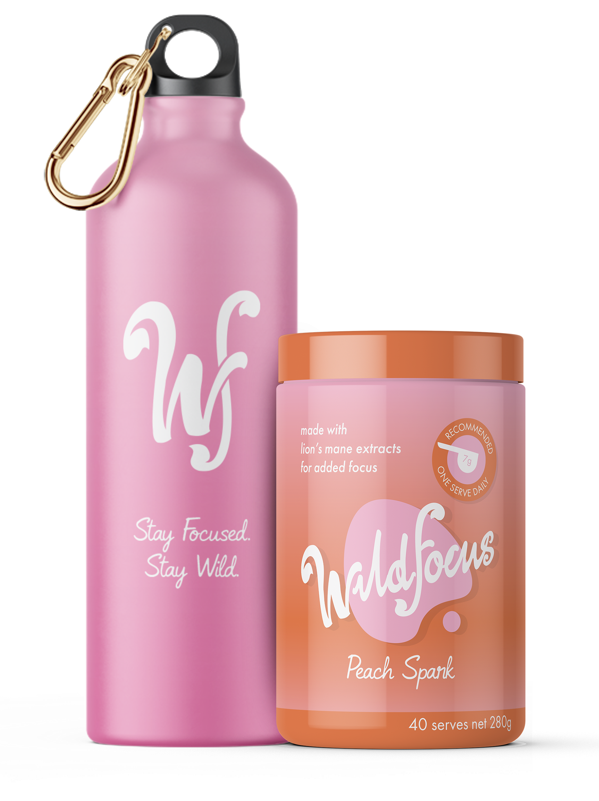
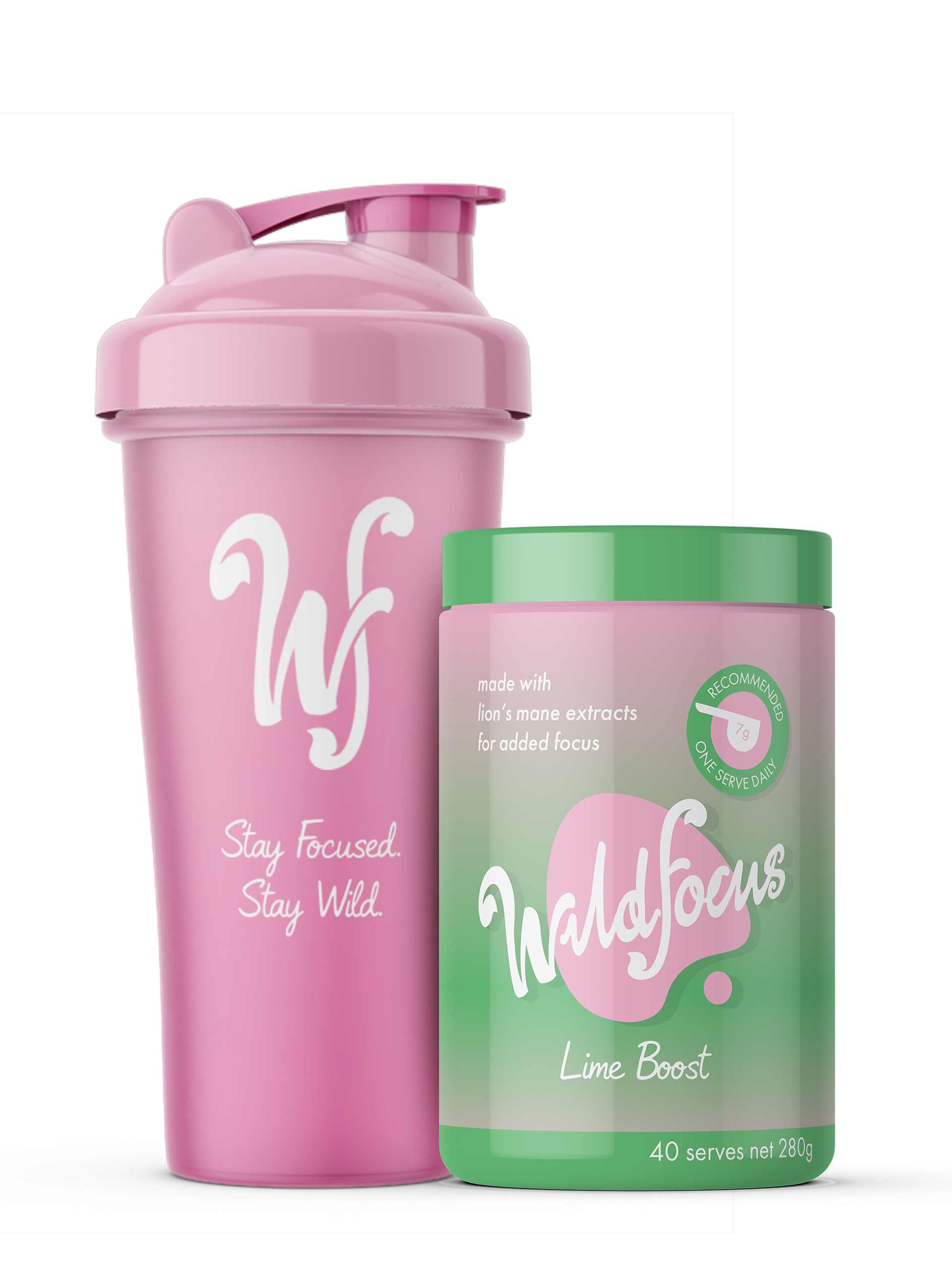
Powder Supplements Packaging
As is common within the energy drink category, the WildFocus brand also includes powdered supplement products. To maintain visual consistency across the range, the powder packaging reimagines the core can designs, carrying through the same colour system, branding, and graphic language from each flavor, to ensure a cohesive and recognisable brand experience.
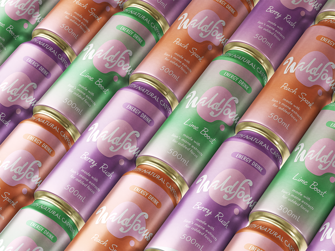
Bulk Can Packaging
The bulk packaging also carries these principles forward. By extending the recognisable colour profiles of each flavour, the pack becomes immediately identifiable at a distance.
This approach not only supports existing customers locating the product but also functions as a larger-scale visual advertisement, helping attract new consumers through strong retail shelf impact and brand visibility.
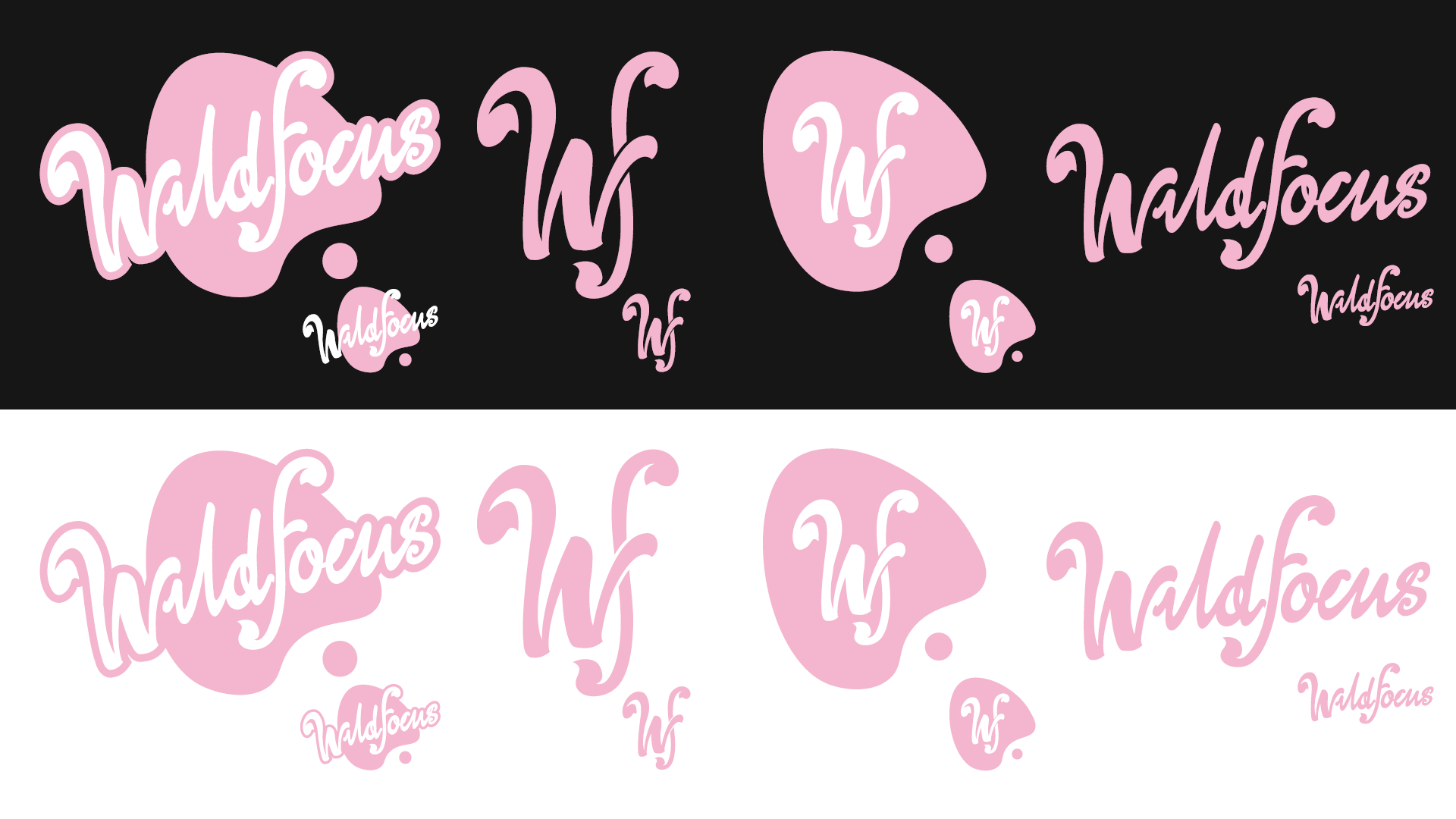
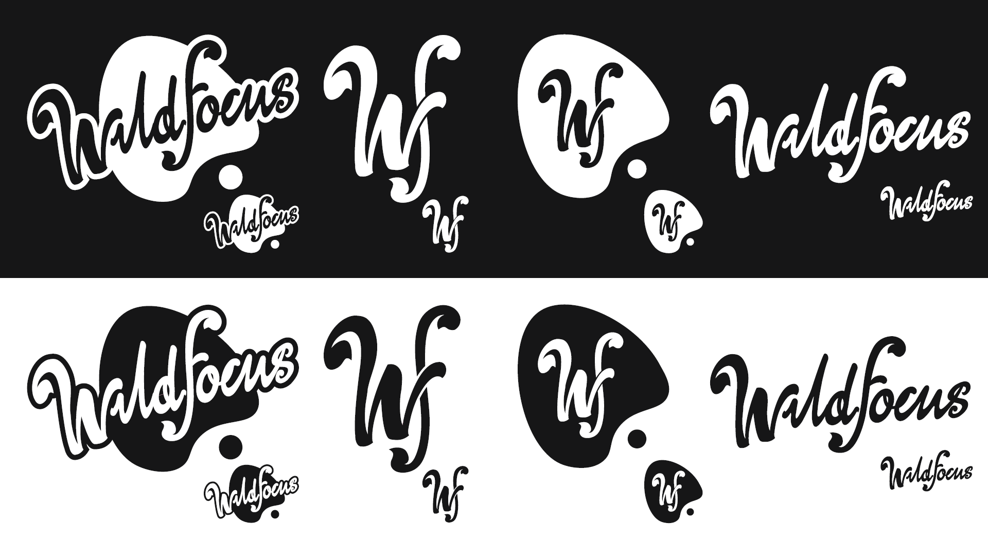
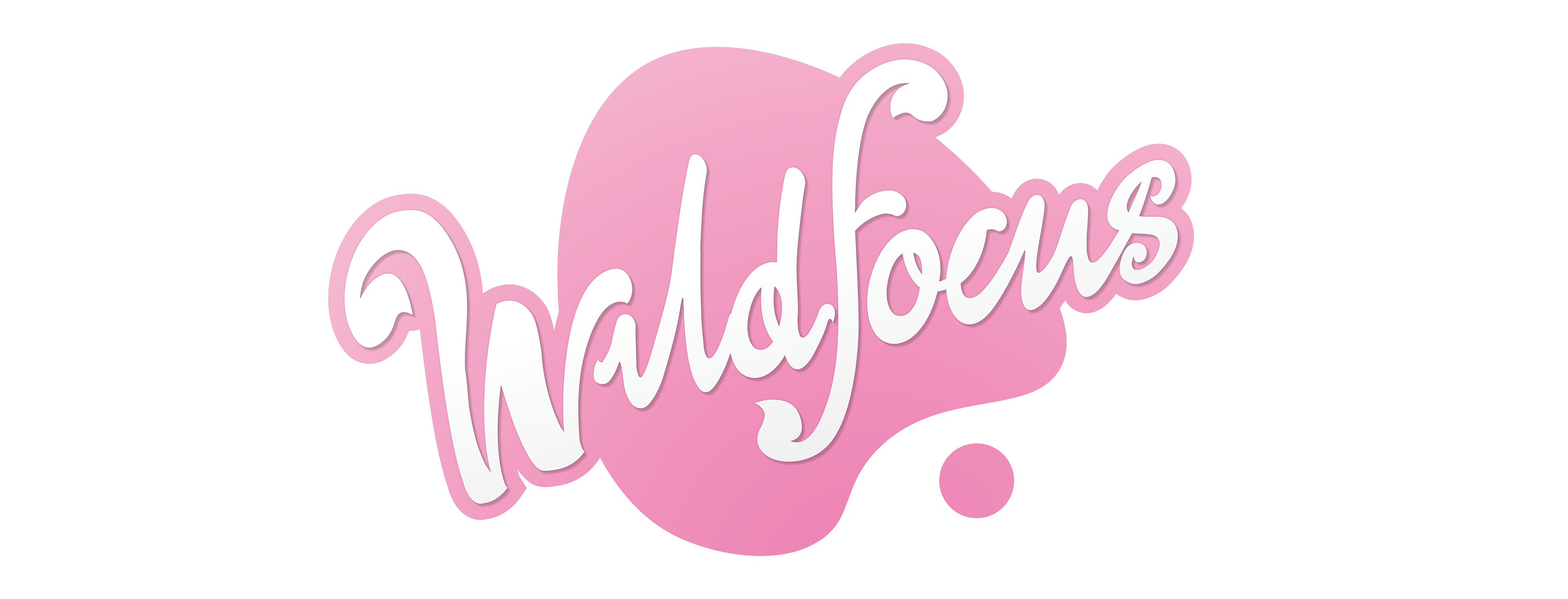
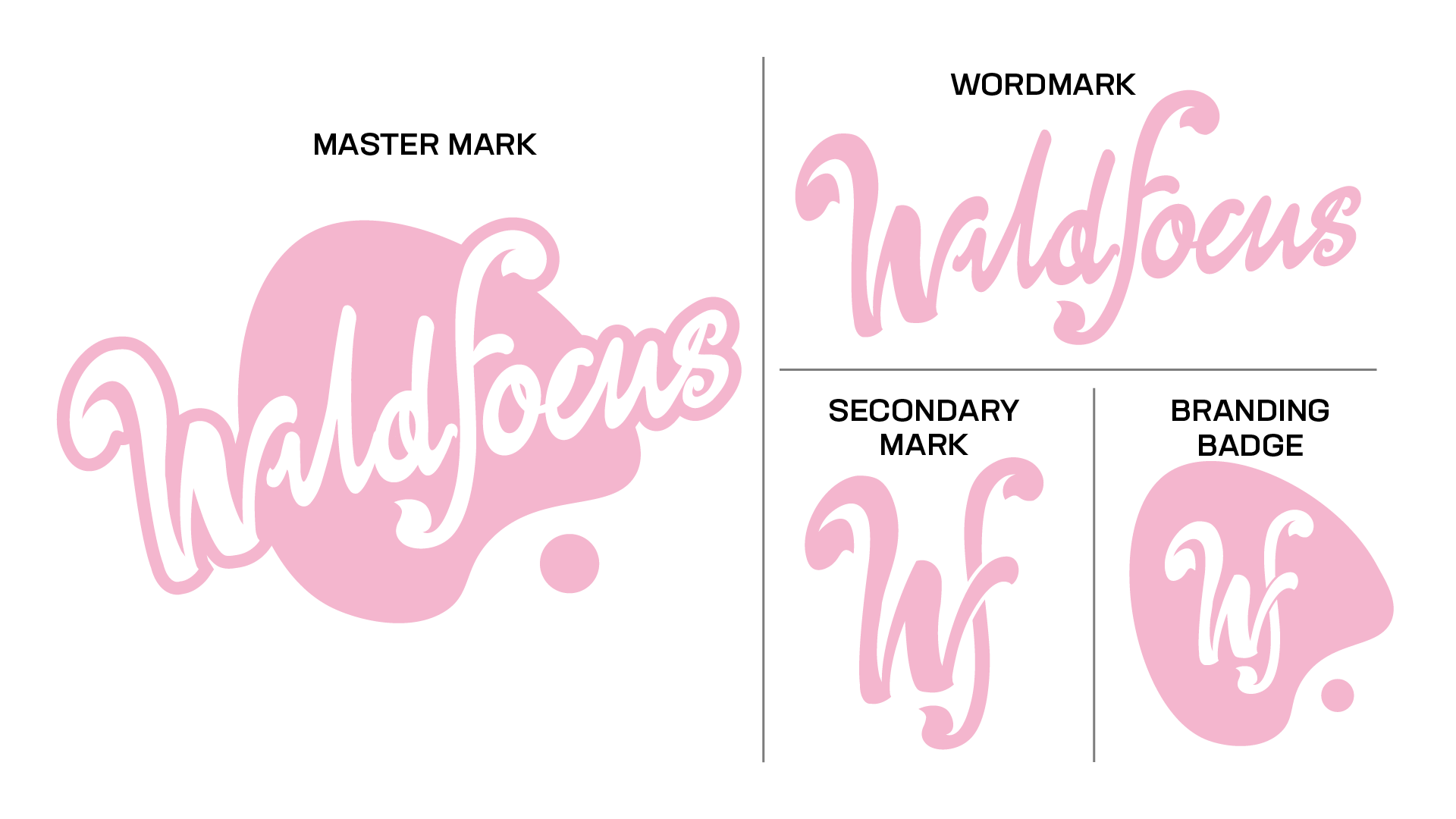
Logo Variations
The WildFocus brand features four core logo variations: the Master Mark, Secondary Mark, Branding Badge (favicon), and Wordmark. This range ensures visual consistency across all platforms, applications, and collaborations without requiring any significant alterations to the brand identity.
The Master Mark serves as the primary brand identifier and should be used wherever possible. The Secondary Mark is designed for applications with limited space. The Branding Badge maintains strong recognisability of the Secondary Mark while being contained, making it ideal for use as a favicon or digital icon. The Wordmark is intended for situations where space constraints prevent the effective use of the Master Mark.
Proof of Versatility and Viability
All logo variations have been tested on both black and white backgrounds, as well as in monochrome, to ensure clear legibility, strong contrast, and consistent visual impact across a wide range of applications, as shown below.