Client:
Mythic Brews - Scottish Beer Brand
Project:
Packaging and Brand Design
Goal:
To design a packaging-first brand identity.
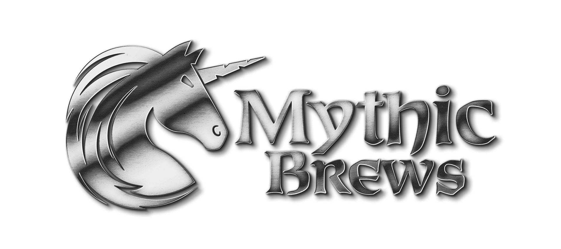
A Beer Born of Myth
Mythic Brews is a Scottish-inspired beer brand concept. At the heart of the brand is the unicorn iconography, the national animal of Scotland, which was chosen for its deep roots in Celtic mythology. This mythical connection informed both the name Mythic Brews and the use of a Celtic-inspired typeface in the wordmark, creating a cohesive narrative across the brand. The colour palette draws from the blue and white of the Scottish flag, reimagined through deep navy tones and refined silvers to achieve a clean, premium aesthetic while still honouring its cultural references.
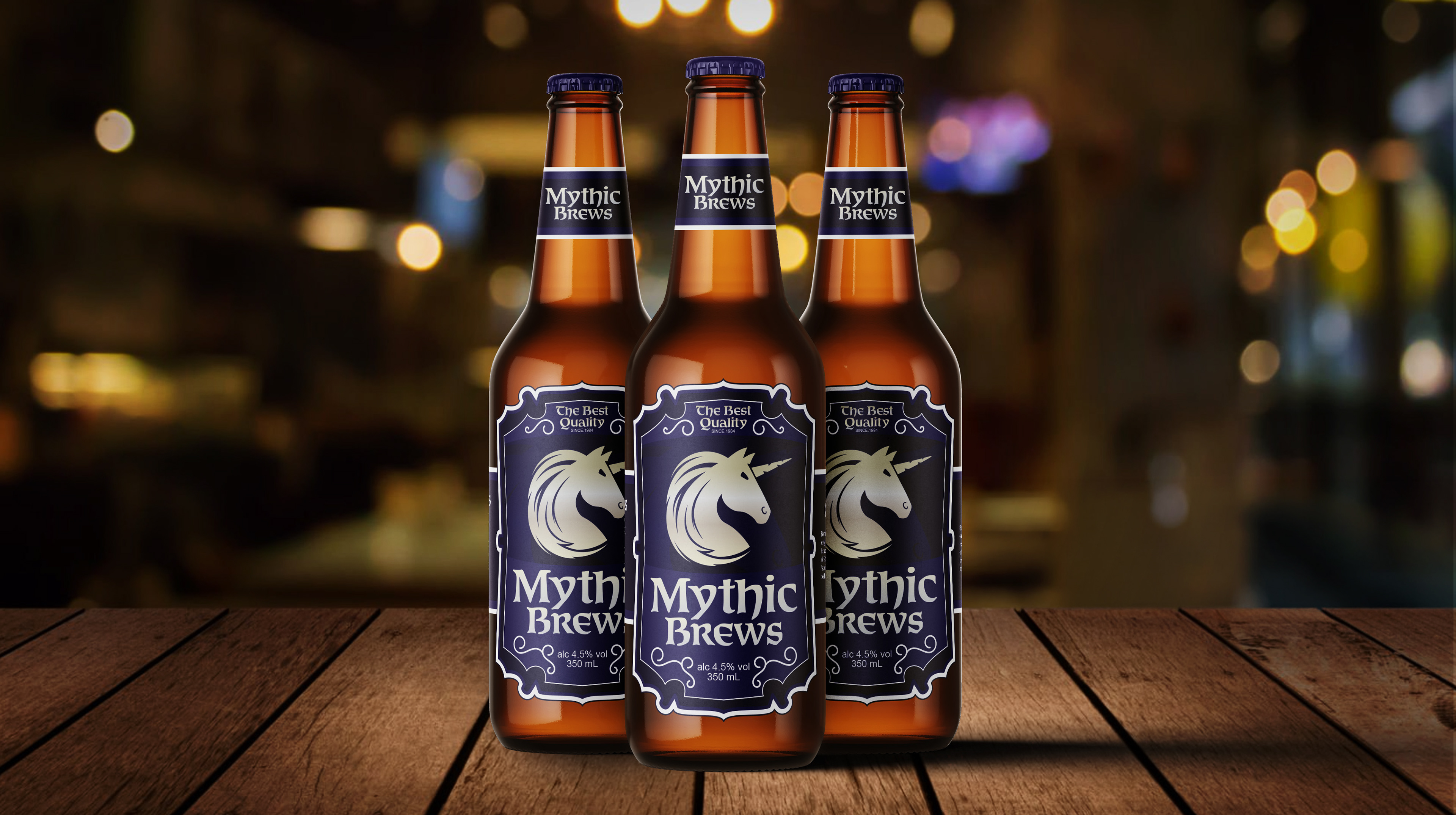
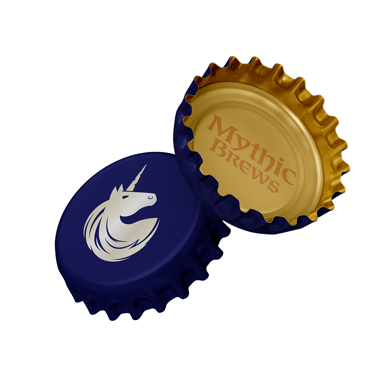
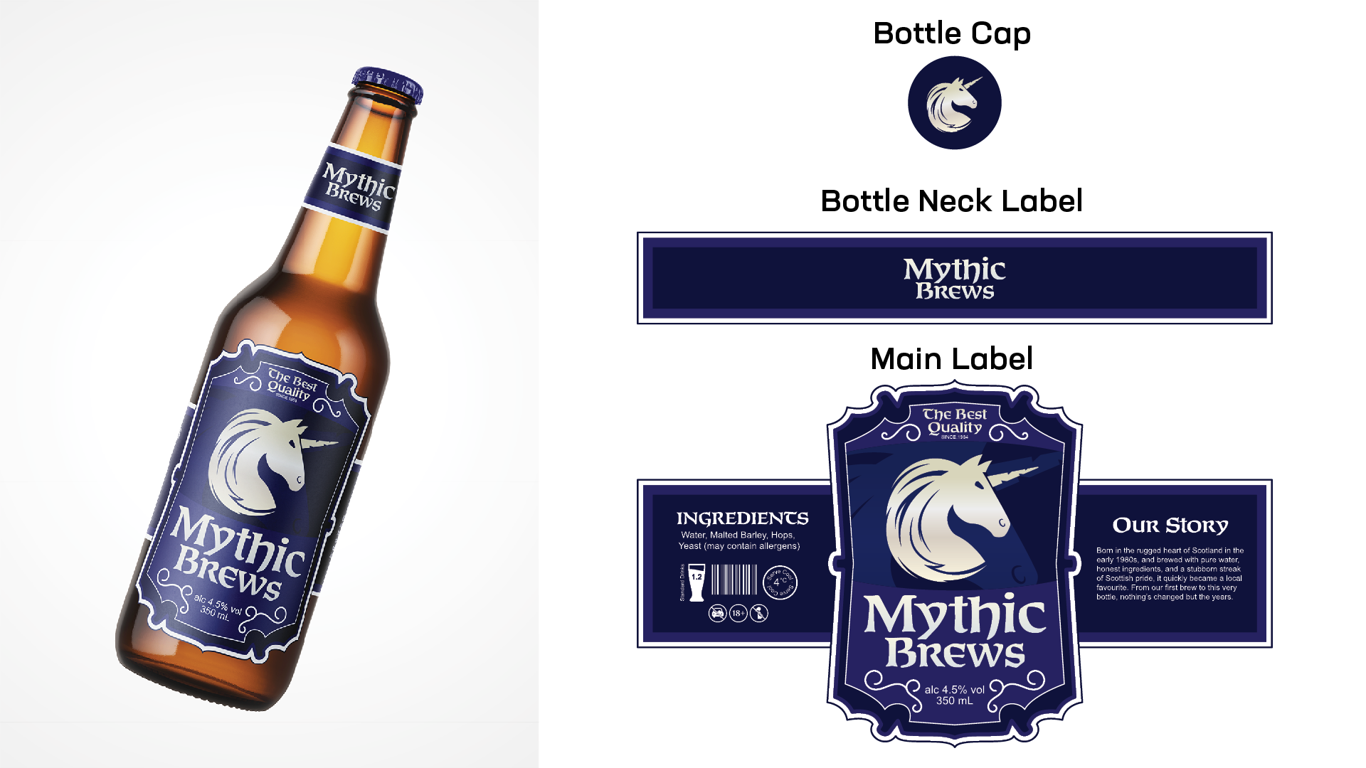
Main Packaging Bottle Label
The primary design element for this project is the beer bottle branding. There are three elements to the bottle's branding, the main label, the bottle neck label, and the bottle cap. Each element works together to fully brand the product while also being able to be identified individually. This ensures that even after consumption, the discarded elements, such as a ripped label or opened bottle cap, still identify as Mythic Brews to any observer.
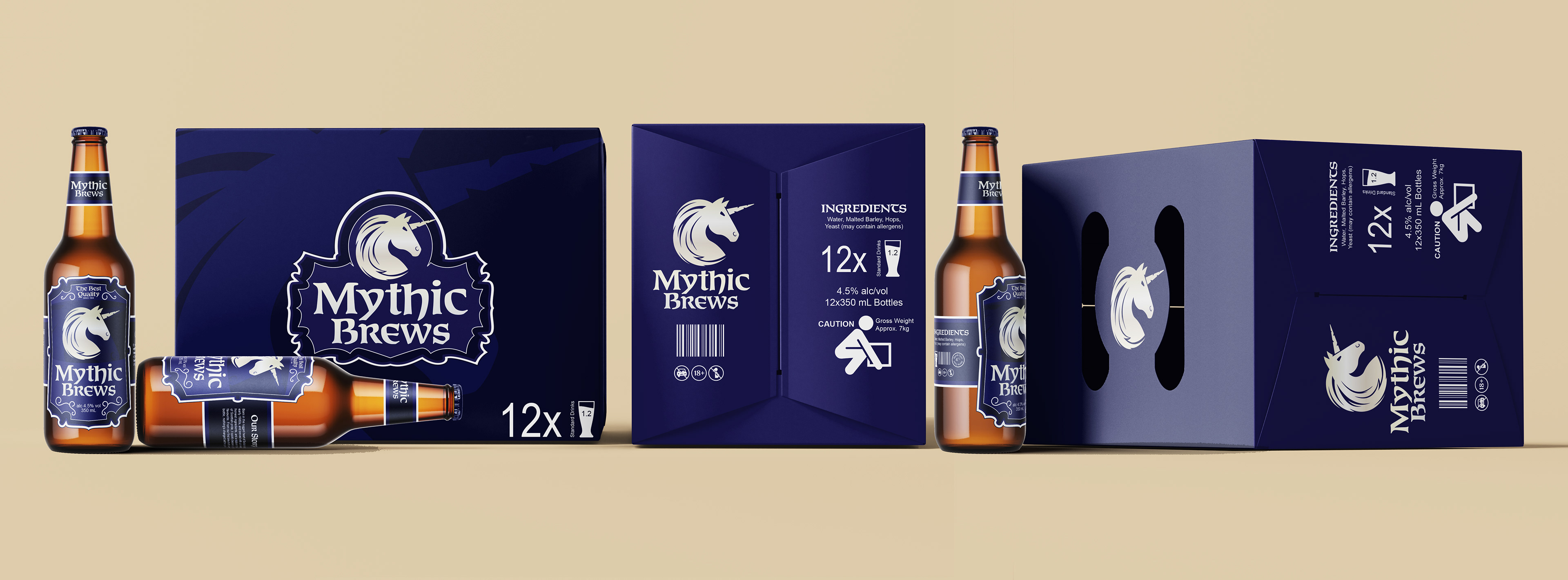
Carton Packaging
The bottle carton packaging is the second most important branding touchpoint as it provides an opportunity to stand out on retail shelves and attract new customers, while directing existing customers. While the bottles will still be the primary branding touchpoint, customers will interact with, the carton serves as an opportunity to extend the brand identity and recognition, reinforcing the name and brand identifiers in the customer's mind.
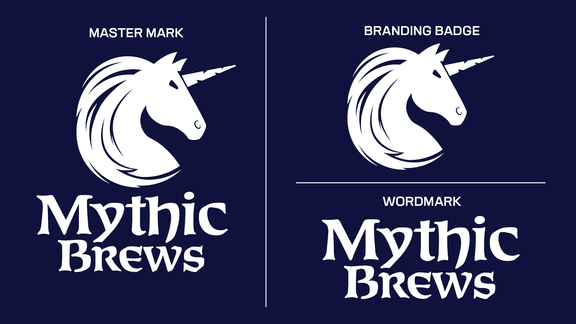
Logo Variations
The Mythic Brews brand features three main logo variations, these being the Master Mark, Branding Badge and Wordmark. This range ensures visual consistency across all platforms, applications, and collaborations without requiring any significant brand alterations.
The Master Mark serves as the primary brand identifier and should be used wherever possible. Although primarily stacked, the Master Mark can also be used horizontally with the brand name to the right of the unicorn icon. The Branding Badge is the most versatile of the branding, being used at small-scale branding opportunities such as favicons and bottle caps, as well as being utilised as a background image to add depth and texture. Finally, the Wordmark is intended for situations where space constraints prevent the effective use of the Master Mark, and the use of the branding badge is not sufficient in relaying the brand, such as in promotional material designed to attract new customers.
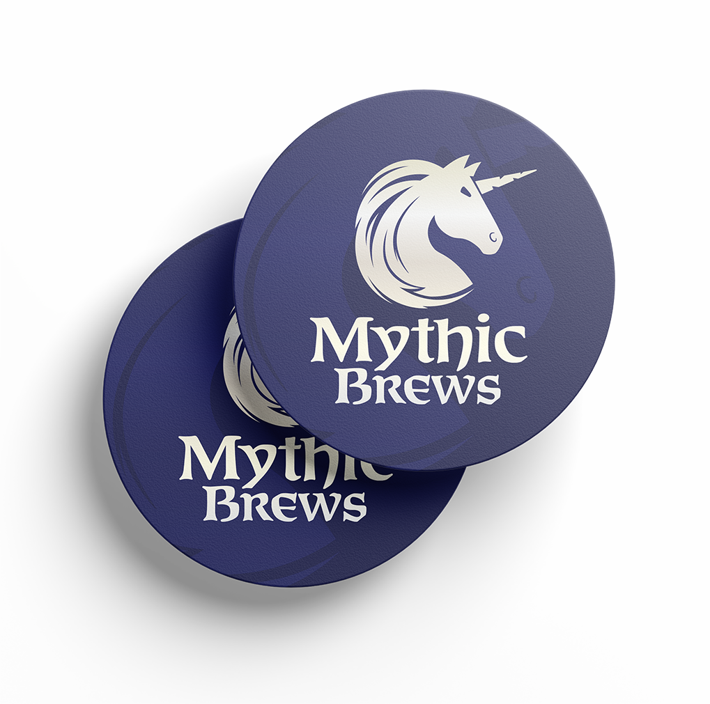
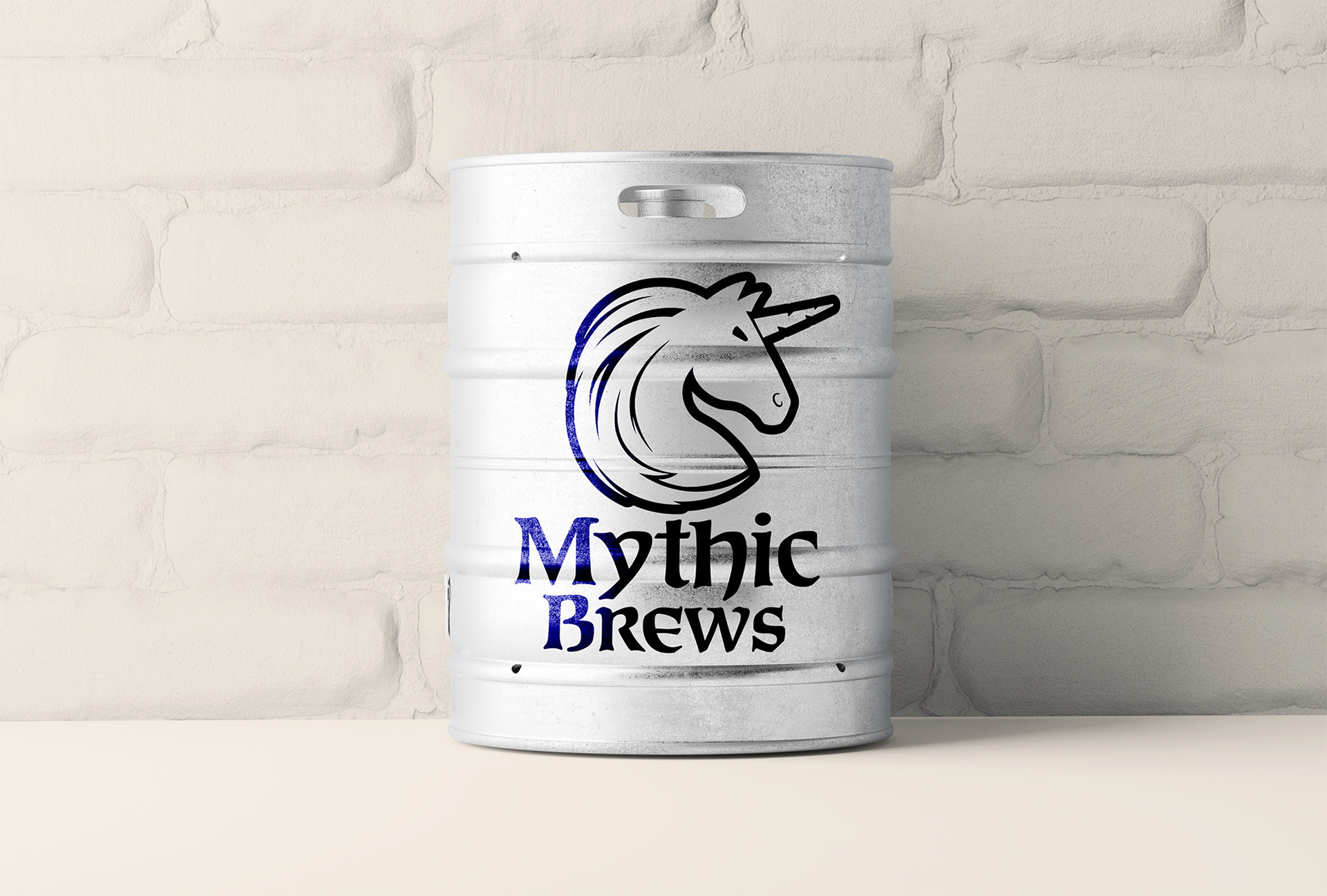
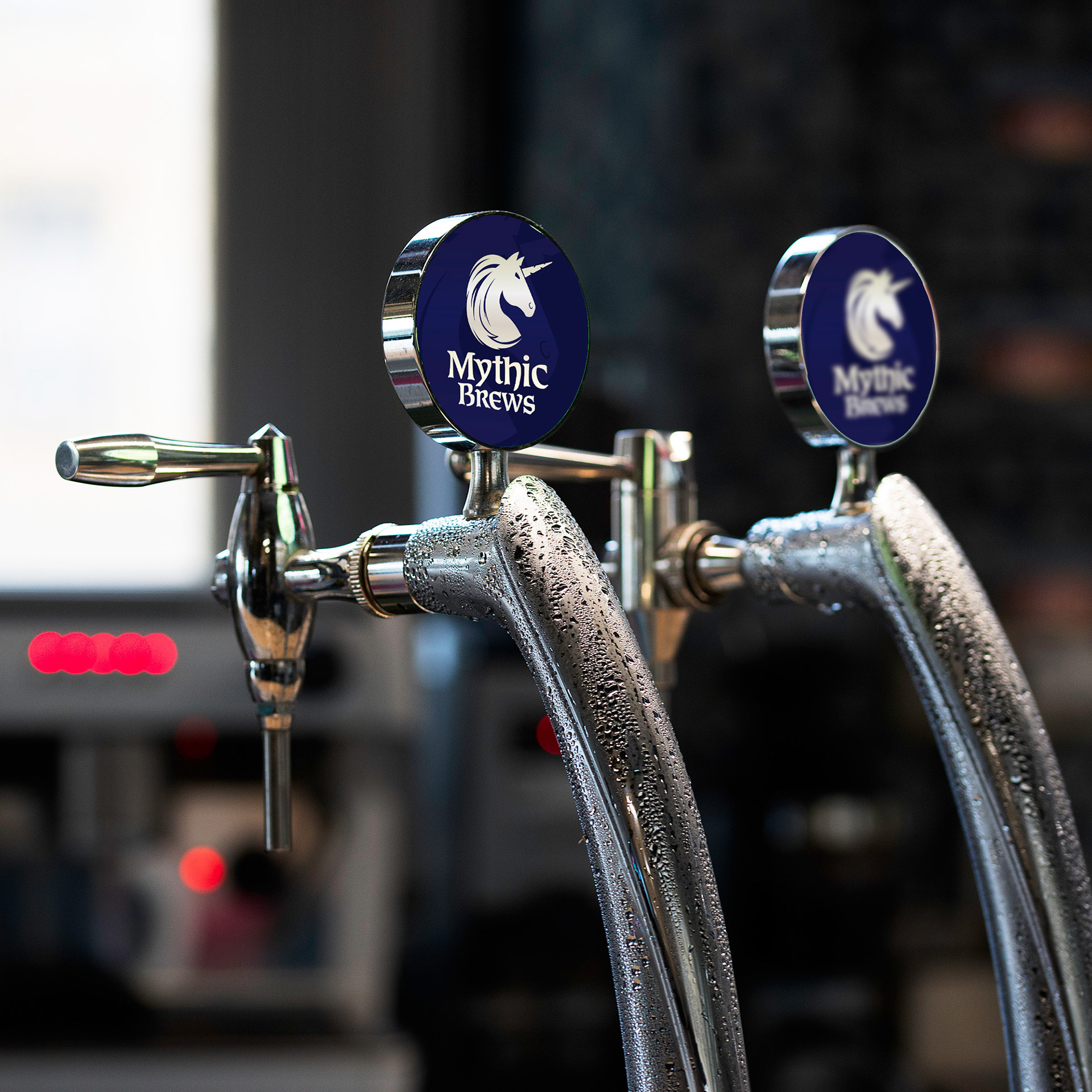
Additional TouchPoints
In addition to the bottle and carton, the brand recognition is extended through touchpoints such as coasters, bottle caps, kegs, and beer tap handles, each featuring the unicorn mark and refined Celtic typeface. Together, these touchpoints create a consistent, premium presence across every interaction with the brand.