Client:
Independent Support Providers
Project:
Branding Package (Including logo, colours, and fonts)
Goal:
Build a cohesive and accessible brand
Empowering Independent NDIS Service Providers Through Thoughtful Digital Design
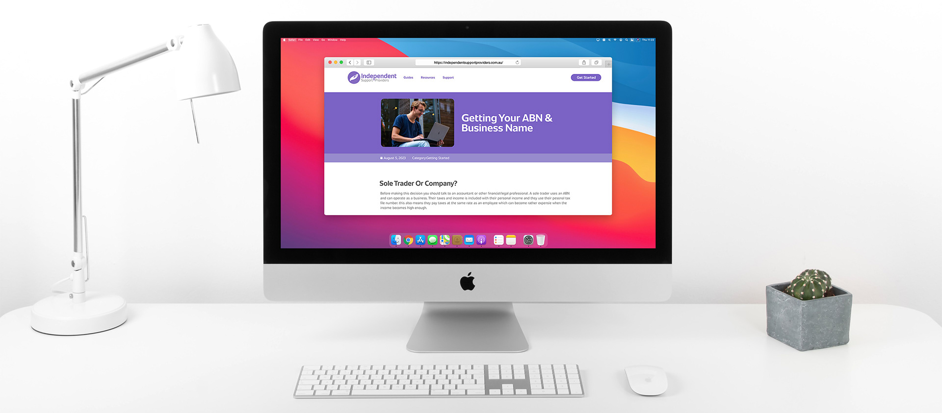
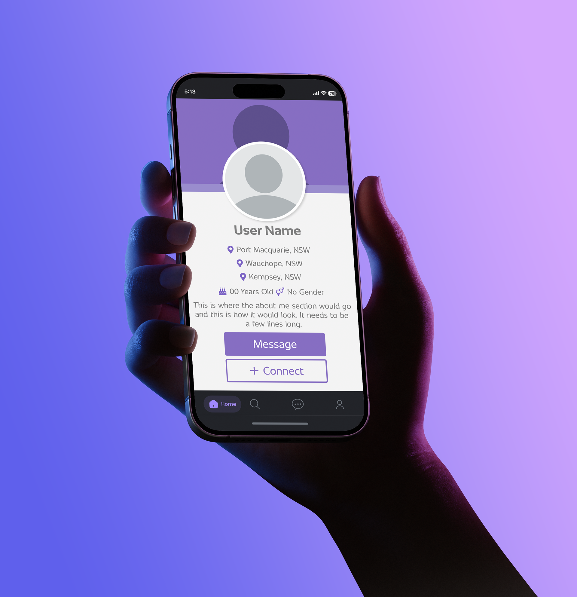
For this collaboration, I worked with a web service upstart to develop branding, web page layouts, and a comprehensive user interface. The service aimed to inform NDIS service workers on how to start working independently while also providing them a platform to market themselves and connect with potential clients. This platform had two sides, with only the clients being able to view and reach out to the service workers to ensure safety and prevent misuse. This design meant creating two distinct websites while still connecting them through branding touchpoints and themes. In addition to creating the branding elements, I also provided a complete brand style guide including logo variants, webpage layouts, profile designs, colour scheme, and required fonts.
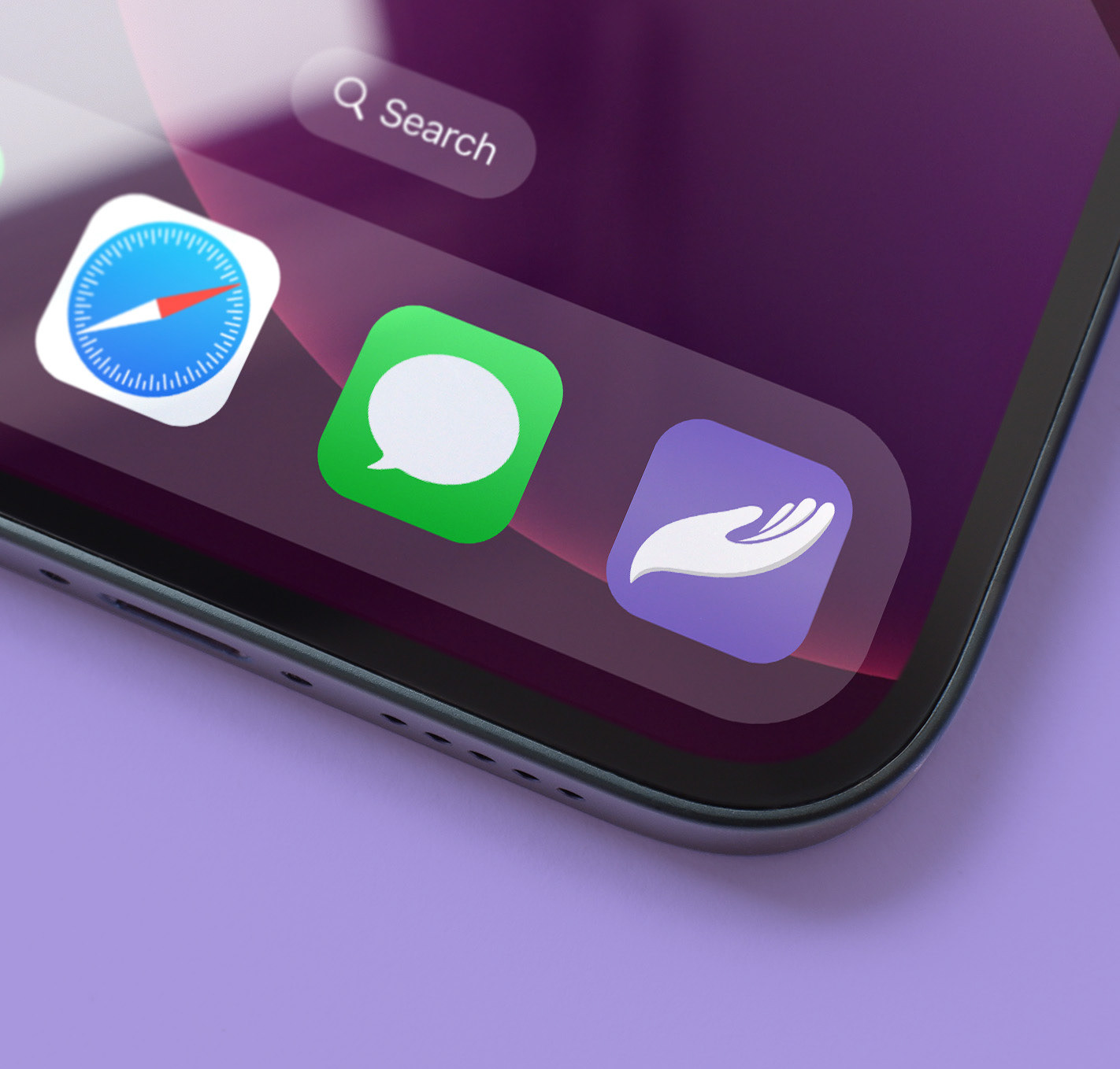
Mobile App Assets
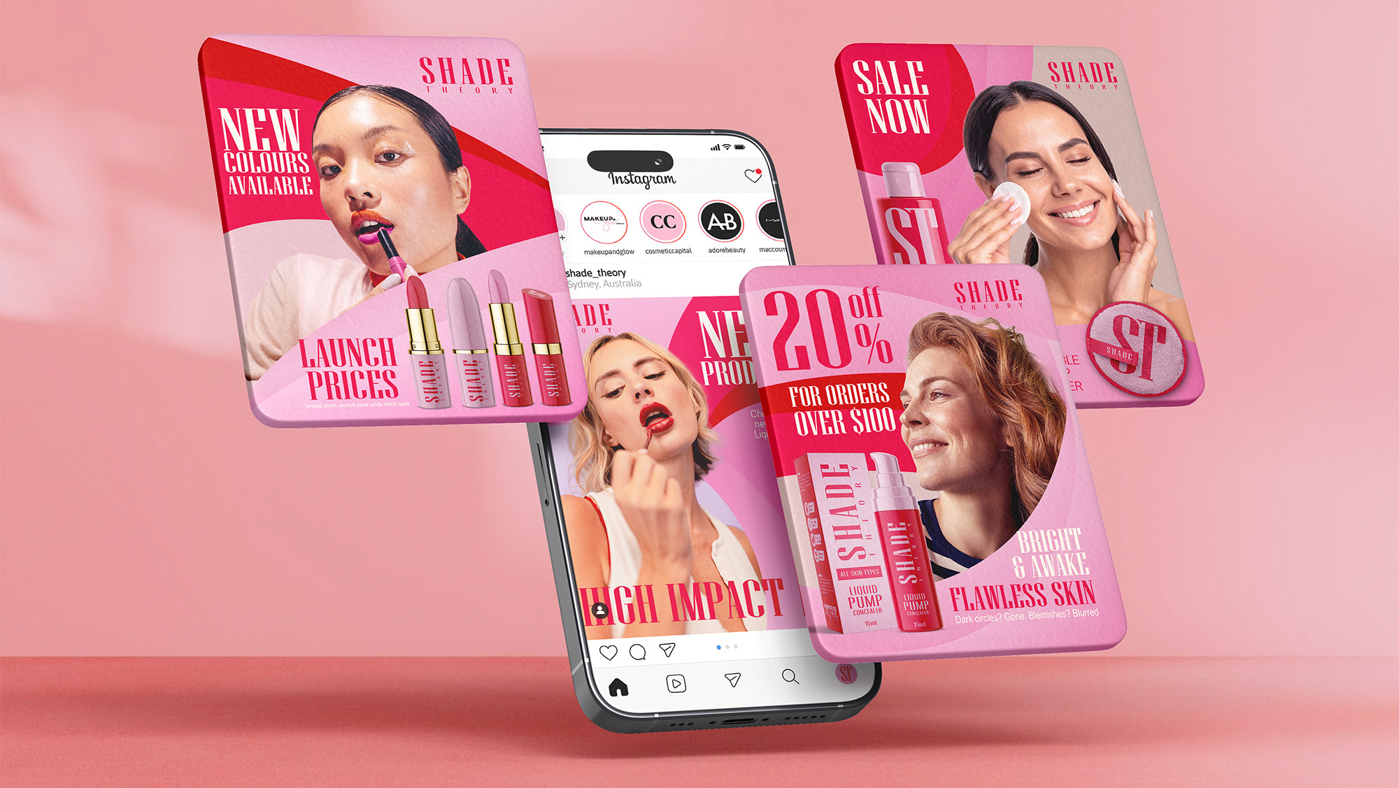
Alongside the web experience, I also designed custom assets for the mobile app interface tailored to both user groups, ensuring a seamless extension of the platform across devices. This involved creating custom graphics and UI assets that reflected the established brand identity while optimising layouts for mobile usability and accessibility. The app interface was carefully designed to support intuitive navigation, secure interactions, and consistent visual touchpoints, reinforcing trust and cohesion across the entire digital ecosystem.
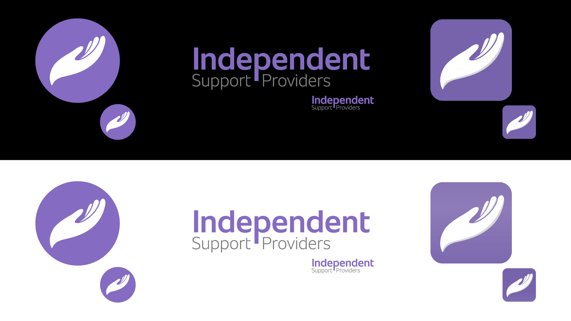
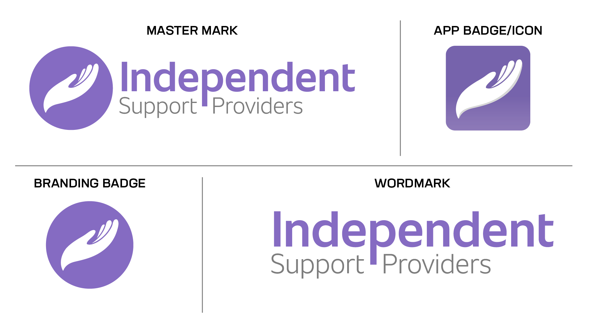
Logo Variations
There are three major variations of the IPS branding mark. These include a Master Mark, Wordmark, and the Branding Badge/Favicon. This range will allow the brand
to remain consistent across all platforms, projects and collaborations without drastic alterations.
to remain consistent across all platforms, projects and collaborations without drastic alterations.
The Master Mark is the primary brand identifier and should be used wherever possible, with the Wordmark or Branding Badge only replacing it when space is limited. The Master Mark remains effective down to 15mm in height, while the more compact Wordmark can be used at sizes as small as 12mm. When horizontal space is extremely limited, the Branding Badge is the preferred option, maintaining recognisability even at very small sizes, including use as a favicon.
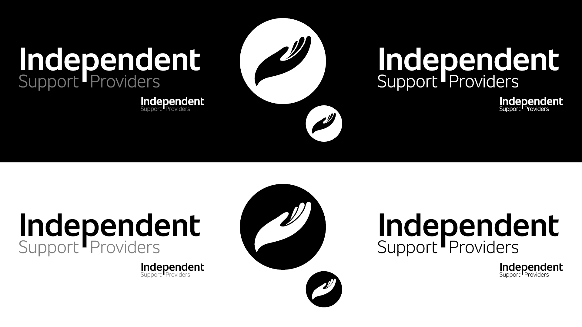
Proof of Versatility and Viability
All logo variations have been tested on both black and white backgrounds, as well as in monochrome, to ensure clear legibility, strong contrast, and consistent visual impact across a wide range of applications, as shown below.